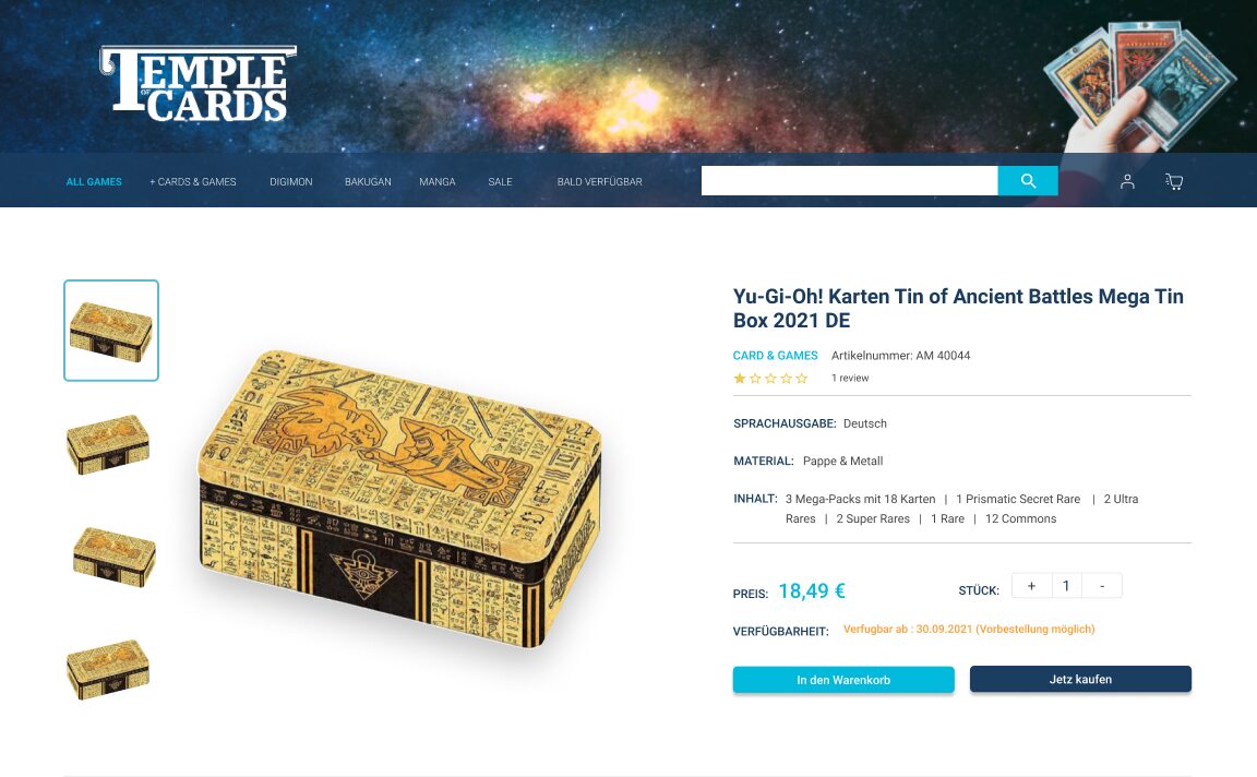
When I received the assignment, I was very excited because I am also a fan of games. I know pc games and their categories very well, but I don't remember these card games sold in the "Temple of cards" store. The truth is that all the colours and graphics of the games catch my attention. Their striking colours and expressive figures are mesmerizing. However, when I opened the Temple of Cards page, it took me a long time to understand what it was all about.
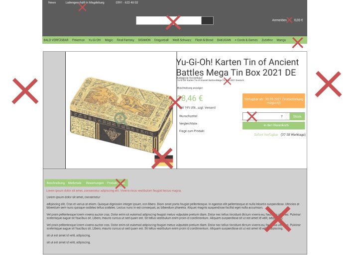
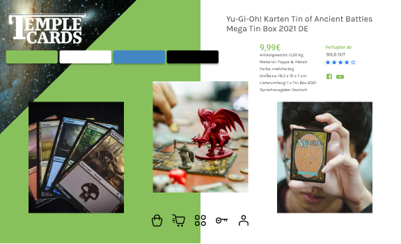
The choreography of the page follows the mental models of other e-commerce sites like Amazon. The header occupies an important space, the footer at the bottom of the page, the product is on the left, with its respective thumbnails, the product description on the right, purchase price and purchase system on the right, this is something very optimistic that I see in this site.
However, the elements are almost together, and the hierarchy is lost. The pieces need a space where they can "breathe".
-The header has information that should not be there (address, phone) and should be in the footer.
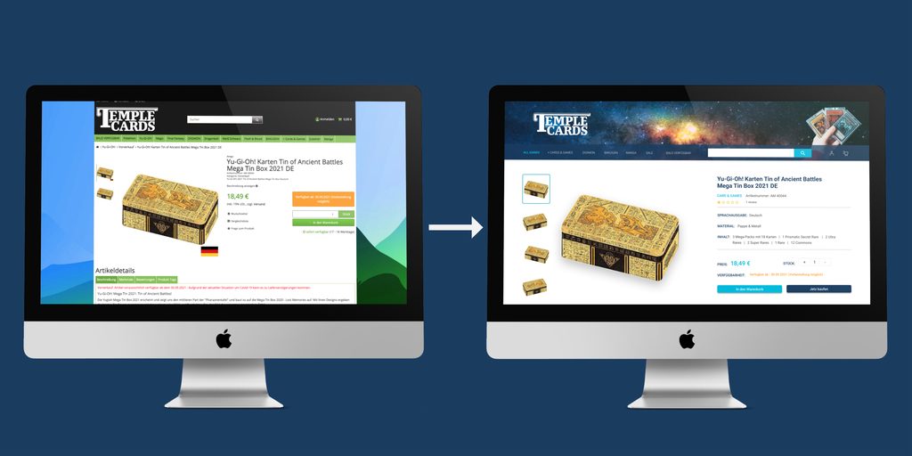
The page uses a background that distracts the user from buying the product. The background in web design is considered old fashioned. Instead, it will be better a total width.
In the page's design, it is immediately noticeable that it is without a grid created. When designing the user interface, I would suggest using a grid of 12 columns and a margin of 60 pixels. Lack of structure.
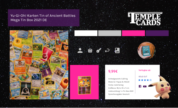
-The information architecture should be organized, with structure, and the labels should make sense. For example, the navigation is very confusing; there are too many elements, it lacks taxonomy
-The icons to increase the quantity of a product you want to buy are too small.
-The buttons are disproportionate. The space in the form where the quantity of the product appears is also unnecessary.
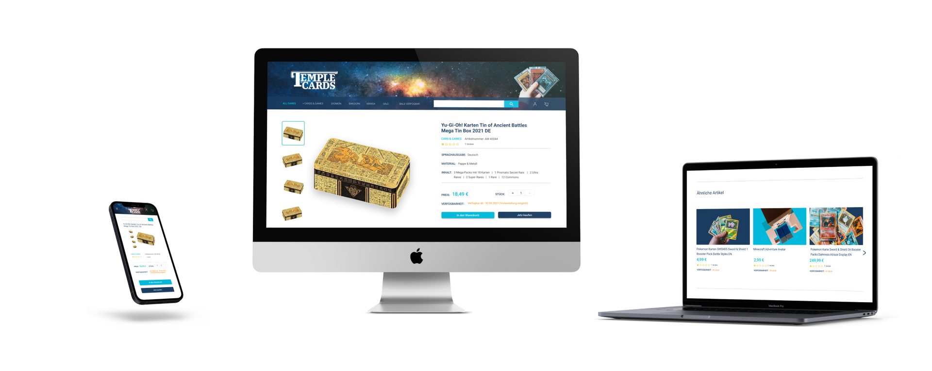
The section "Artikel details" has a submenu that seems very large. There are 4 tabs with more information (beschreibung, merkmale, bewertung, produkt tags). These tabs need to be smaller.
-The Merkmale information seems to be very important and descriptive information that should have a central role in the taxonomy of this page. This information is lost since it is in the second tab.
-The footer is too long and with unnecessary elements.

Best Practices vs Qualitative and Quantitative research
Sometimes when the budget is short, we can analyze the competitors (amazon, steam, trader online, to name an example) and, following the Mental Models, create a product based on ideas that do work. This way, we save time and money by using best practices that already exist.
If, on the other hand, the Stakeholder accepts that we do a study focused on their users, I would start with the following:
Assuming that I would get a response from 100 users buying at Temple of cards, 70% confirm that the mood board, along with photographs of the space, are the ones that fit the attributes: modern, youthful and futuristic. Then with these results, we would already have our brand attribute validated by users, and the design would be user-centred.
2. To correct the taxonomy of the menu and that the categories are also user-centred, I would suggest making a Card-sorting. Send the types to the users through a survey and organize them.
This way, we could reduce the navigation size in categories that are also known and identified by the users.
3. I would also suggest surveys or interviews understand the most critical information for the user. When buying this product (size of the card box? brand? colours? how many items are inside the box?), we could correct the chaos on the page due to so much information and reduce the product description only to relevant information to the user.
4. After prioritizing the information and giving relevance to the user's choices through the research study, the next step would be to improve the structure of the page through the use of grids and margins, this would improvise the visualization of each element, and thus the impact would be an increase in the conversion of the website.