
When I was told that I would work for a small company that brought coffee from Colombia to sell in Berlin, I was very excited. It is related to my origins, and I am a aroma's coffee lover. I have to say that I thought I knew enough about this beautiful plant from South America. Still, by doing this project, I understood that I knew nothing.
I learned many new things: coffee needs a certain minimum height for its cultivation. Its seed must be roasted in a specific way. The type of roasting varies from light to the strongest. Obviously, all this information was obtained from our interviewees, all coffee lovers, but true coffee lovers, not like me who bought coffee from the supermarket. I thought I was buying the most expensive of the 3 options available, which is a bit like a joke.
The truth is that one word that was mentioned a lot among the drinkers of this plant elixir is the word COMFORTING.
Coffee welcomes you in the mornings and gives you that energy you need. It cheers you up when you are down in the dumps. For me, it usually gives me that push I need to finish the day. For many, coffee has become a great companion, a friend of gatherings and nowadays even a great motivator. It is no wonder that "Kaffe La Finca" is so successful in the new Silicon Valley Berlin it's transformed.
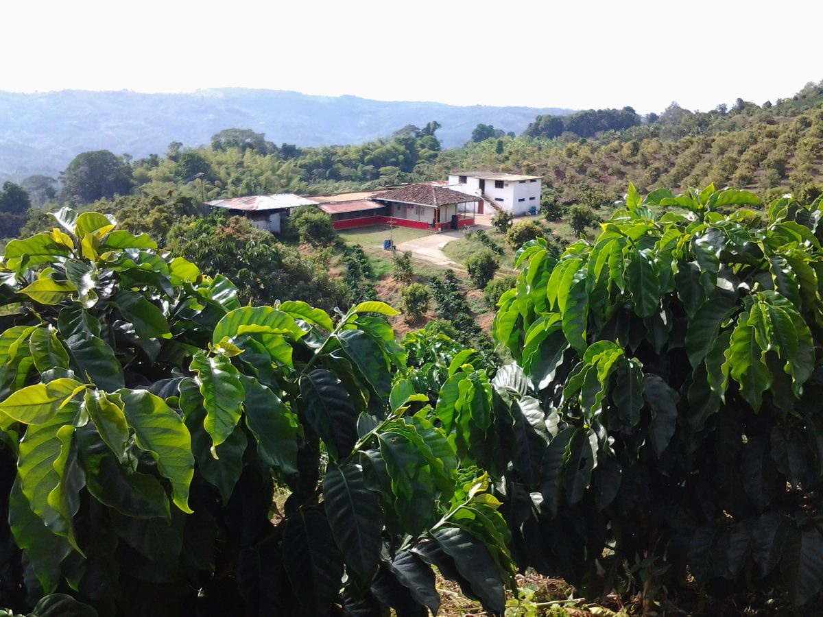
Our stakeholder Kaffe La Finca is already popular with their customers. At the weekly markets, people recognize them. The coffee is often sold out before the end of the day. When we met one of the founders, she explained that she wanted to bring quality coffee to Europe. They wanted the customers to know that the coffee came from fair trade and is ecological, appropriate, and transparent. For them, this was the most important thing.
Although Kaffe la Finca already had a web page. The speciality coffee and fair trade message needed to reach their clients through a new platform representing them while maintaining their essence. The website they were currently using does not have a call to action on the main page. There is no relevant information about the farms and the coffee farmers. We needed to change this.
RESEARCH WEEK
COVID has hit small and medium-sized businesses in many ways. The farm has had to look for options on reaching buyers, so they also started selling their 3 types of coffee on small e-commerce. When we looked at the website, we realized that the site lacked structure, although they were on the right track concerning the message of trust they wanted to transmit.
So we asked ourselves, how are we going to make the small e-commerce more attractive?. The key would be in a reorganization of the information architecture. This is what we were going to focus on.
For this project, we had a deadline of 9 days. For the first three days, we wanted to have ready the whole process of quantitative and qualitative research. We managed to get 200 responses through surveys in 48 hours and 7 interviews of users obtained through social networks and websites of coffee lovers only. The interviews were scheduled more or less from 30 to 45 minutes.
We elaborated an affinity diagram concluding that our goal was How Might We communicate the relationship between "La Finca" and the farmers on the website more clearly.
After the 7 interviews, (we enjoyed each and every one of them) and with the learning that users gave us, we elaborate an empathy map to find patterns among each fan from aroma's coffee.
The user persona we created was Lucas, a 36-year-old IT Specialist from Berlin.
"When I wake up, I need a good cup of coffee to have the energy to start the day". Lucas doesn't mind spending more money when he knows he is contributing to a good cause.
In the competitor analysis, we investigated: "Coffee Circle", "The Barn", "19 Grams", "Bonanza", "Nuru", and "Tekei". All possible competitors and most of them with an e-commerce site.
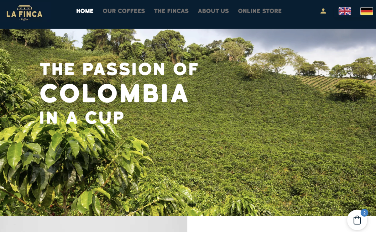
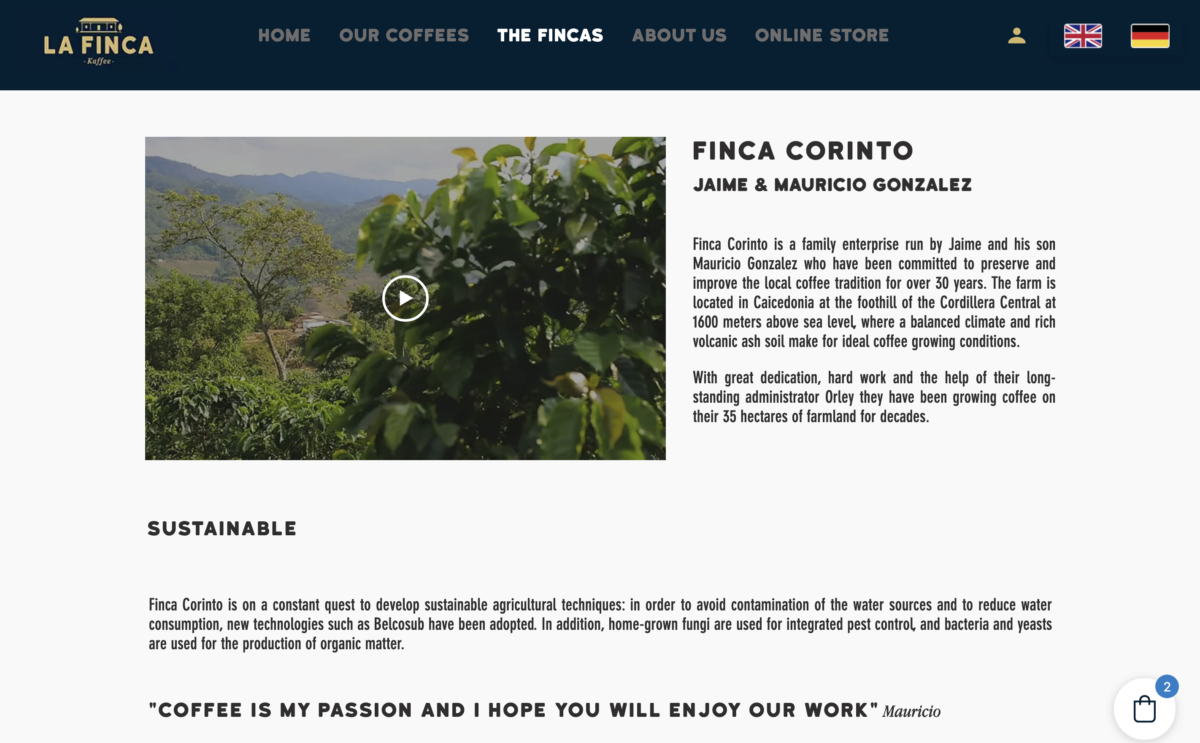
Our user would enter the home page. The first thing he would find would be a cover with a CTA button to buy directly or go to the e-commerce page. The user decides whether to go to the online shop or on the welcome page to know the three leading farms that produce a coffee destination, Corinto, Esmeralda and Laguito. The user could always buy the coffee from a call to action button in each farm description.

PROBLEM 1
“User needs a way to know the relationship between farmers and the brand because for the price they pay it should be fair”.
HYPOTHESIS 1
“We believe by improving the hirerchy of the website content we will achieve a better trust between the brand and users. We will know we are right when La Finca increase the sales on the website”.
PROBLEM 2
“User needs to buy the coffee on the website as clear as possible because right now is not very clear how they should proceed”.
HYPOTHESIS 2
“We believe by improving the buying journey on the website La Finca will have more sales. We will know we are right when they increase the sales on the website and lower the drop-off number”.
SOLUTION
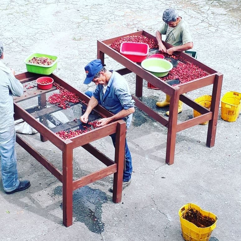
Among the problems encountered by users, they did not know if the fare trade was honest, they had difficulty finding it online. Speciality coffee buyers were usually very concerned about the environment. For them, it was crucial the information that appeared on the packaging of the coffee. In the work that we delivered to "Kaffee La Finca", we wanted to give a 180-degree turnaround to the shopping experience. Our satisfied stakeholder's words said we improved it ultimately. When we delivered the design project based on the user.
We gave exclusive prominence in e-commerce to the three different types of coffee. We highlighted the relationship of the entrepreneurs with the farms (also three farms types). Altitude, region and type of roast were our main characters in this exciting journey.

DESIGN DECISIONS
Our user would enter the home page. The first thing he would find would be a cover with a CTA button to buy directly or go to the e-commerce page. The user decides whether to go to the online shop or on the welcome page to know the three leading farms that produce a coffee destination, Corinto, Esmeralda and Laguito. The user could always buy the coffee from a call to action button in each farm description.
The design decisions were based on the interview we had with the stakeholder and with the users. Respecting that, the owners of "Kaffe la Finca" wanted to keep the style they already had and their colours. To verify that they were right, we submitted their style to a survey where we created two mood boards. The respondents chose the one with the colours and logo of "Kaffe La Finca" in a survey answered by 62 participants. They indicated that the mood board with the essence of our client was the one that best represented their attributes: fair trade, transparency and engagement. We kept the logo and used the base colours gold and blue.
TESTING & PROTOTYPING
We tested the mid-fi with 4 users, and the task of the user test was:
Task A: please go to the website and try to understand what this website is about... Tell me loud about the insights of the website...
Task B: Get information about the Esmeralda Finca and about its coffee?
Task C: Please buy a package of 250gr (whole beans) of Esmeralda coffee
The users understood quite well what the site was about. We also checked when testing them that the architecture we had created for the website was well structured. The importance we gave to the three farms made it very easy for the user-test to find the coffee. What we had to minimize was the process of buying a pack of coffee. Reduce the checkout flow until the user gets the "thank you for your purchase". By reducing the purchase table and entering the photo with bean and size, the customer understood what to buy.
We dedicated the last 4 days to developing a High Fidelity Prototype in Figma for the web and a reduced version for mobile to finalize the project. We delivered the MVP to our client with a 10 minutes presentation. The client was pleased with his product, and at this moment, the website is in realization with our design and will be online soon. We also created a style guide for the stakeholder and the programmers. You can see it at this link.
We are very proud to say that it was a charming and satisfactory work experience with Marlene, Felipe and Corentine. We thank them enormously for having trusted us.
