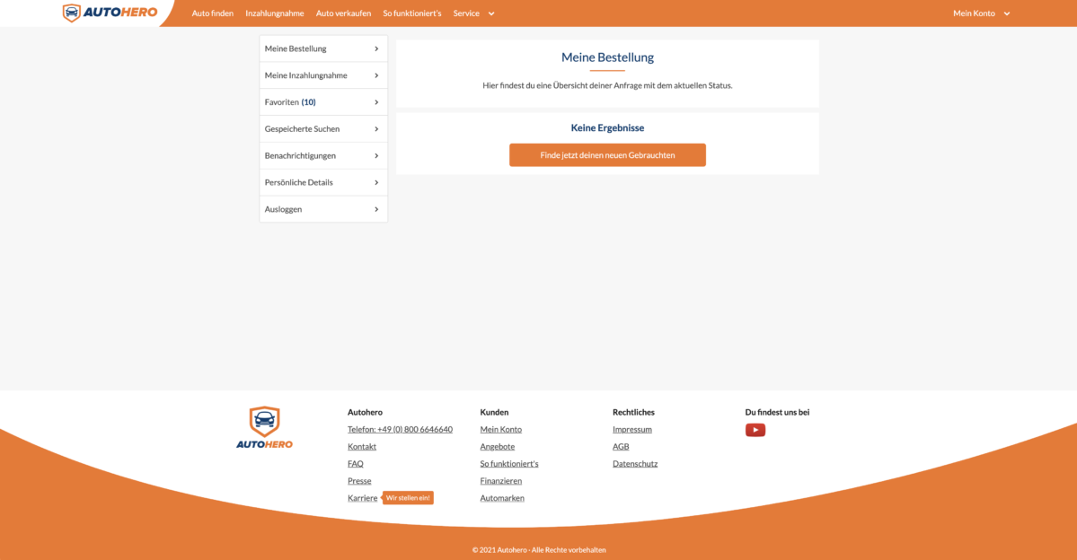
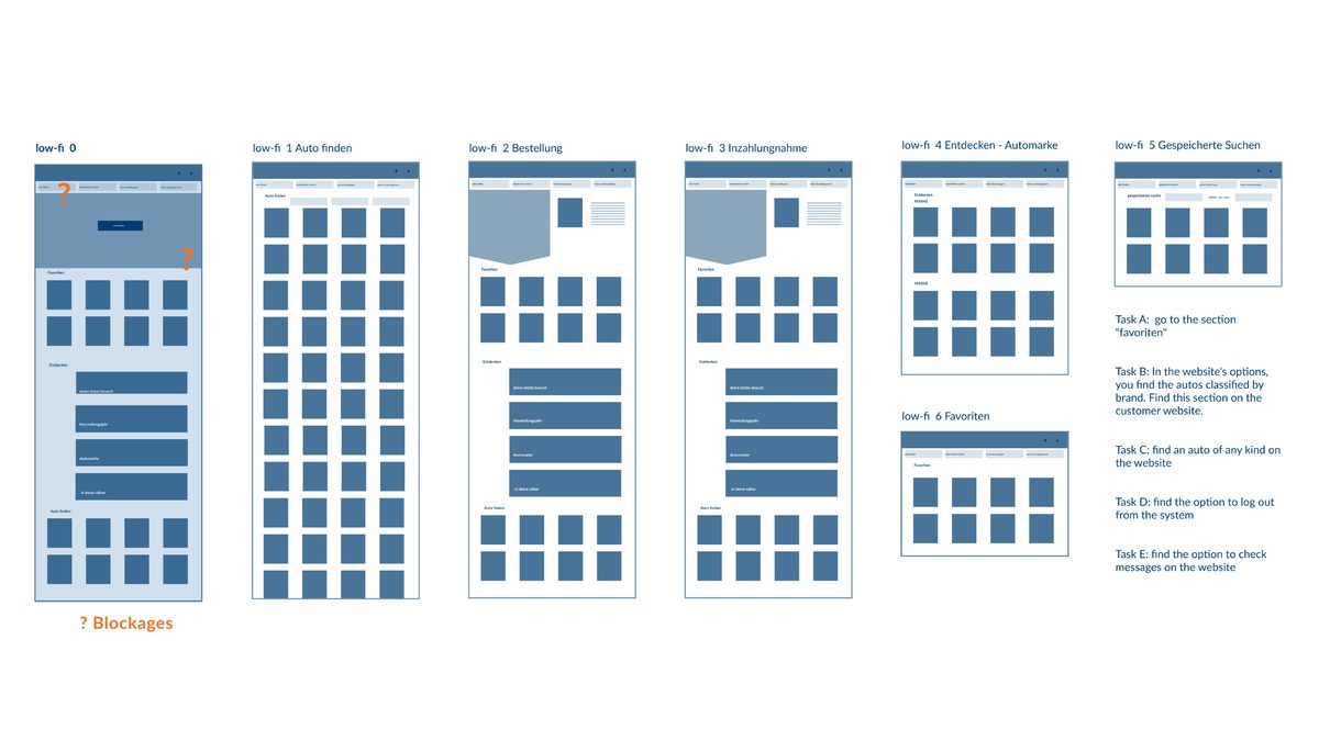
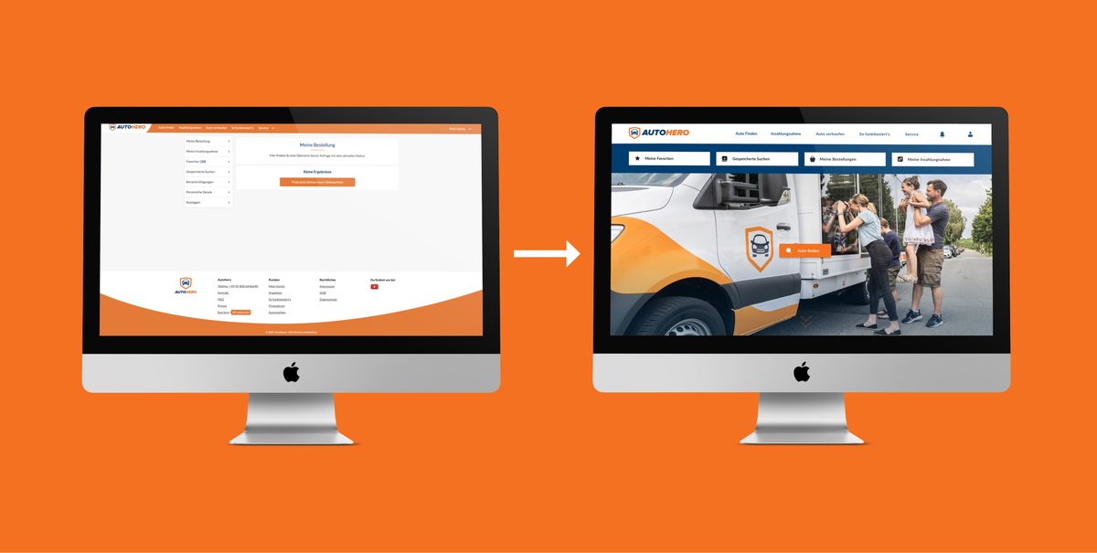
Before & After "Auto 1" user page


     Salling an Auto with "wirverkaufendeinauto.de" was one of the smoothest experiences that I have when using a B2C platform. It was fast, practical, accurate and reliable...just like our 80 years old friend "Paul" have told us. He found the website very easy to use and he say we will get our money very fast. And so it was... That's one of the reasons I decided to limited the changes to the basics.


The primary goal of any business is to increase its sales and increase the growth of the business


     Prepared a competitor analysis where I proposed to take the brand to a friendlier and more attractive position. The brand attributes from Auto1: Functional, Trustworthy and Friendly; all those were here compare with the competitors. I still wanted to give the platform a bit more of character and personality.

     The user journey is essential to understand that buying a car, in most cases, is a long term idea

For example here: the user have this on his mind since is 7 years old, but he buys his first car, (31) thirty one years later.

     Which of these pictures represent better the words or phrase: TRUSTWORTHY, FRIENDLY, ENGAGING, "yes, I'm gonna buy my dream car and spend that money." Although the moodbard survey results were very close. I based the decision on the nine coma five (9.5) percent more users who chose blue. Also the compelling reason that the call to action button comes to life when the background is orange. Call to action buttons are very important for the conversion of a site.


Heuristic Analisis


  1. Utilize whitespace
  2. Establish clear and Visual Hierarchy
  3. Use of icons
  4. Organization of drop-down menu
  5. The feeling of being logged in
  6. Increase usage of the user page
  7. Eliminate distractions
  8. The main task: buy a car
  9. Maintain the functionality


Sketching


     One design process I use is to deconstruct the shapes. Separate the set of elements and then play with them. When I studied architecture, I learned to analyse a building from the figures that compose it, cubes, cones, cylinders. In the case of two-dimensional, I use triangles, squares and circles to test shapes. As I said before, my goal was to eliminate distractions. That's why I decided to use the one page design.


Testing


     They always said: "better one test than no test". Once I had the look and feel of the user-page, I decided to create a 7-frame flow to have a complete experience. When testing the low fi, I found the following blockages: the user did not scroll down and could not find the section favourites.


Next steps:


-Research is always essential; otherwise, it is like we are doing magic; when no time for research, we could ask the help from the customer service team because they are in contact with the users and they work with a lot of userdata every day.


-Research is our friend


-My suggestion is to try a BETA VERSION, observing it, tested and checking the results and so on...


-Create new shortcuts inside the main page, that provide the user with more types of search, classified the adventures cars like jeeps and vans; another shortcut could be Holidays cars; for the city cars; for the summer cars, like convertibles.


Create an AUTO TINDER, and the checked cars will be directly save as a favourites.